
The most common reason a remote design project goes wrong is not the designer’s skills. It is the brief. When you are working with someone in the same office, you can point at things, riff in real time, and course-correct instantly. When your designer is in a different country and a different timezone, working from a written document you put together in ten minutes — the margin for misalignment is enormous. The good news is that a well-structured brief closes most of that gap before any work begins.
This is not theoretical. Every designer who works with international clients has two kinds of projects: ones that moved quickly and felt collaborative, and ones that ground through revision cycle after revision cycle with neither side understanding why. The difference is almost always traceable back to what was — or was not — in the original brief.
Why Remote Briefing Is a Different Skill
When you brief someone in person, the back-and-forth fills in the gaps automatically. You say something imprecise and they ask a follow-up question. You gesture at something on screen. You see their face when they do not understand and reframe on the spot. A remote brief has none of that. It has to stand on its own.
The designer will read it, make assumptions about what you meant, and start building based on those assumptions. If your brief is vague, those assumptions drift from your vision fast. And by the time you see the first draft, you are already one full revision cycle behind where you should be.
A brief that takes you 30 minutes to write carefully can save three revision cycles, keep the project on schedule, and — most importantly — get you output that feels right the first time rather than the fourth.
This is not a critique of remote designers. It applies to any working relationship where asynchronous communication is the starting point. The brief is the only conversation you get before work begins. It needs to do the job of every clarifying question that would otherwise happen in real time.
What Every Brief Needs to Include
A good remote design brief answers six questions before the designer has to ask them. These are not optional fields — each one closes a specific gap that, if left open, will cost you a revision round.
- What are you building? Not just “a website” — a lead generation site for a financial advisory firm targeting 35–55-year-old professionals in the UK.
- Who is the audience? Demographics, pain points, what they care about, and what turns them off.
- What do you want people to do? One primary action per project: book a call, buy a product, fill in a form, subscribe.
- What tone does the brand have? Three to five adjectives: “professional but approachable”, “premium without being cold”, “bold and direct”.
- What do you like and dislike visually? This is where reference images come in — covered in detail below.
- What does success look like? Not “make it look good” — “first-time visitors understand within ten seconds what we do and why it is worth paying for”.
The Reference Image Rule
This is the single highest-return investment in any design brief, and the one most often skipped. Before you write a word of description, spend twenty minutes finding five to ten websites, logos, or visual styles that you genuinely like. Then do the same for styles you actively dislike.
The reason this matters so much: design language is hard to describe but easy to point at. “Clean and minimal” means different things to a developer in Johannesburg and a marketing manager in Leeds. “Like this” removes the ambiguity entirely.
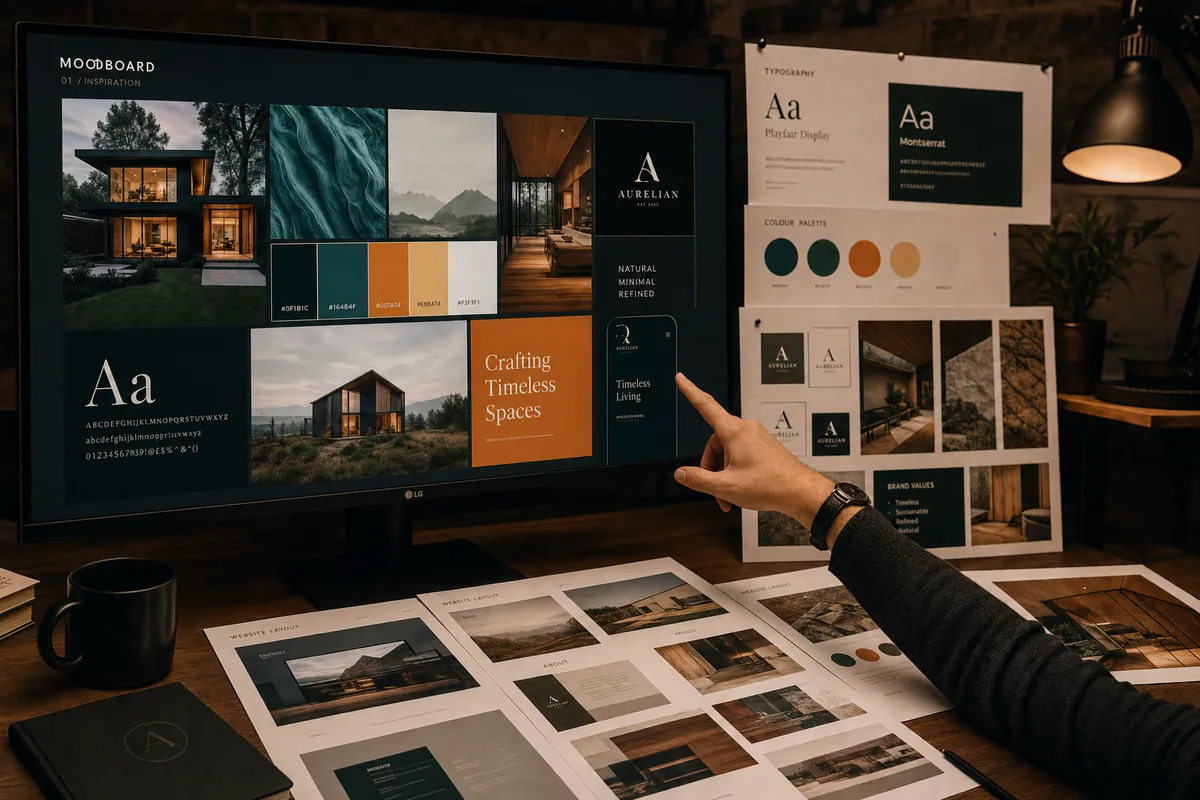
Visual references do more work than any written description. Collect five to ten before you write a single word of your brief.
Add a note to each reference explaining what you like about it specifically. “I like the typography here, not the colour palette.” “The layout structure works for me but the tone feels too corporate.” That specificity saves a full revision cycle — the designer can absorb your aesthetic instinct without having to guess at it.
How to Give Feedback That Actually Moves Things Forward
The second most common point of failure in remote design projects is feedback. Most clients give feedback by describing their emotional response to a draft: “I don’t love it”, “it feels off”, “can we make it more exciting”. This type of feedback is genuinely hard to act on. The designer cannot see what you are comparing it to in your head.
Useful feedback is specific and directional:
Vague feedback
“The colours feel wrong.”
“It’s not quite what I had in mind.”
“Can you make it pop more?”
“Something feels off about the layout.”
Actionable feedback
“The blue feels too corporate — try a warmer tone closer to reference 3.”
“The hierarchy is right but the headline font is too light for our audience.”
“The CTA button gets lost — increase contrast and move above the fold.”
“The spacing between sections feels cramped on mobile — see screenshot.”
Also important: review structure before style. Confirm the layout and information hierarchy work first. Once that is agreed, address colour, typography, and refinement. Mixing the two turns revision cycles into circular conversations that exhaust both sides without resolving either issue.
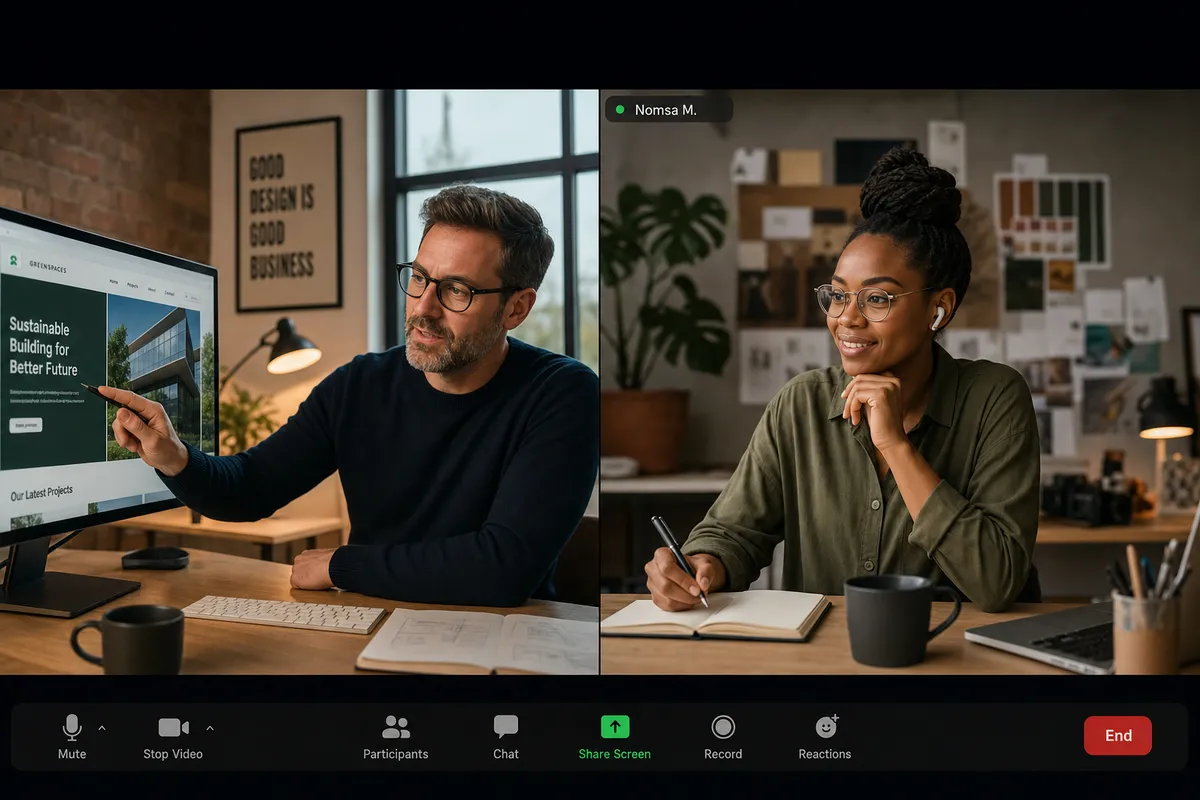
Reviewing structure before style is the most effective way to keep revision cycles short and focused.
A Brief Template You Can Use Today
The template below covers every point a designer needs to start confidently. It does not need to be long — 400 words that answer these nine points clearly will outperform a ten-page document that leaves the key questions vague.
Remote Design Brief Template
Project overview
One to two sentences on exactly what you are building and why — include the deliverable type, the industry, and the context.
Target audience
Who they are, what they care about, what they are trying to solve, and what turns them off.
Primary goal
The one action you want users to take. Be specific: book a call, buy, subscribe, or complete a form.
Tone and brand personality
Three to five adjectives describing how the brand should feel. Include what it should not feel like too.
Reference images — like
Five to ten visual examples you respond to. Note what specifically you like about each — layout, type, colour, or overall feeling.
Reference images — dislike
Styles or examples to avoid. Equally important as the positive references — do not skip this.
Technical requirements
Platform, file formats, dimensions, integrations, and any constraints the designer must work within.
Timeline
When you need the first draft, final files, and any hard deadlines that cannot move.
Success criteria
How you will know the output is right — a specific, observable outcome rather than a subjective feeling.
What a Well-Briefed Designer Can Do for You
When a designer receives a well-structured brief, a few things happen. They spend their first working session thinking about your problem, not sending clarifying questions. They make confident, considered decisions instead of safe, generic ones. And they come back to you with something that is directionally right even if it needs refinement — rather than something that misses the mark entirely and requires a reset.
The goal of a brief is not to remove the designer’s creative judgment. It is to aim it. A talented designer given clear constraints and a well-defined target consistently produces better work than a talented designer left to guess what you want. The brief is not a restriction — it is the foundation that makes creative risk-taking possible.
The best client relationships I have had started with the best briefs. Not the longest ones — the clearest ones. Specificity is a form of respect for the creative process.